2020 Update

2019 In Review

So we have 2017 that was one of the best seasons in recent memory, 2018 being average, 2019 was....

pretty good actually. Not quite the heights of 2017, but ticked a lot of the boxes: a reasonable proportion of good match-ups, upsets, smaller margins, and comebacks.

In 2019, the points difference between teams was 10.8 on average, ranked 34th over all 123 seasons. Not too shabby (2017 was ranked 13th in comparison with a mean difference of 9.1).

Figure 1: Recent distribution of difference in points between the home team and away team prior to the match. The first quarter of the season is excluded to allow enough time for the competition to settle.

Figure 1: Recent distribution of difference in points between the home team and away team prior to the match. The first quarter of the season is excluded to allow enough time for the competition to settle.

Round by round, we see below that there was a reasonable set of match-ups each week, the exceptions being round 20 and 21. Round 20 had these delightful fixtures:

  • GWS vs Syd (5th vs 15th)

  • Fre vs Geel (11th vs 1st)

  • Melb vs Rich (17th vs 4th)

  • Adel vs StK (8th vs 14th)

  • Coll vs GC (6th vs 18th)

  • Carl vs WC (16th vs 2nd)

  • Bris vs WB (3rd vs 10th)

Figure 2: Mean difference in points each round. The first quarter of the season is excluded to allow enough time for the competition to settle.

Figure 2: Mean difference in points each round. The first quarter of the season is excluded to allow enough time for the competition to settle.

We had 20 blockbusters in 2019, instances of two top 8 teams playing each other separated by no more than 2.5 wins. This was 5 matches less than 2018 but we had 5 blockbusters on a Friday night so perhaps it felt like there were more (there were only 2 Friday night blockbusters in 2018). 2019 also only had one weak Friday night match-up, Hawthorn vs Collingwood in Round 16 (13th vs 3rd). Despite the prospects of a poor contest, Hawthorn ended up winning 4 points

Speaking of upsets, this is another good measure of the quality of a season. One definition is when the home team gets up despite having 3.5 wins or greater to date LESS than the visiting team. This situation occurred 25 times in 2019, and the home team got up 9 times (36% vs 21% in 2018). Remember these?

  • Freo (12th) defeated Geelong (1st) in Round 20 by 34 points at Perth Stadium

  • The Bulldogs (13th) defeated Geelong (1st) in Round 16 by 16 points at Docklands

  • Carlton (18th) defeated Brisbane (5th) in Round 12 by 15 points at Docklands

With form like that, no wonder the Cats couldn’t get the job done when it counted in the finals.

The flip-side is where the away team gets up despite the home team having 3.5 wins or more greater than them. This situation occurred 23 times in 2019, with 5 upsets (a 23% upset rate, only bettered 20 times in history). Remember these?

  • Hawthorn (11th) defeat Geelong (1st) in Round 18 by 24 points at the MCG

  • Hawthorn (9th) defeat West Coast (3rd) in Round 23 by 38 points at Perth Stadium

  • Carlton (18th) defeat Freo (8th) in Round 15 by 4 points at Perth Stadium

  • North (13th) defeat Collingwood (2nd) in Round 15 by 44 points at Docklands

2019 also had one of the highest incidences of comebacks, where one team is behind at every change except the last or where a large deficit at 3/4 time was overcome). It was on par with 2017 (and 16th best of all time) with 11% of matches having large turns of fortune. Here were the highlights:

  • Doggies are down by 30 points at 3/4 time vs Hawthorn @ MCG then go on to win by 19

  • Hawks down by 31 points at half-time vs Carl @ York Park then go on to win by 5 points

  • Adelaide is down by 25 points at half-time and 16 points at 3/4 time vs Melbourne @ Marrara Oval; they go on to win by 2 points

  • GWS are down by 21 points at half-time vs Geelong @ Kardinia Park; they go on to win by 4 points

  • Carlton are down by 29 points at qtr time vs Fremantle @ Perth Stadium then go on to win by 4 points

And, finally, the per season mean and median winning margin decreased again, to levels not seen since the 1970s. Despite my team, Melbourne, having a shocker, 2019 was a competition showing signs of good health.

Figure 3: Mean and median winning margins per season.

Figure 3: Mean and median winning margins per season.

So if it was so good, how did it translate into match attendance? Well, it was quite a mixed bag and followed club fortunes as a (very) general rule. Carlton fans started to to turn up again, averaging 47k while Melbourne's gains of prior years were lost, only averaging 29k, a level last seen in 2015. Disappointingly for the AFL, Gold Coast had fewer fans turn up than last year but perhaps they switched to Brisbane, up 34% to an average of 25k, a level not seen since 2010.

Figure 4: Year-on-year change in home team attendance.

Figure 4: Year-on-year change in home team attendance.

Improvements in Predicting Match Attendance

Once again, I am trying to hone my predictive model for match attendance. As expected (and nice to see), adding an additional season’s data has not yielded an improvement in RMSE (5,242 with the SVM Polynomial algorithm). As a reminder, RMSE means root mean square error, basically the average error of the model, that, on average, the model either under or over predicts match attendance by about 5,200 people each match. So, what’s left to try?

One trick up my sleeve is to trial an algorithm that is commonly the best performing algorithm at my work, XGBoost. XGBoost is the Porsche of Gradient Boosted Machines, a very powerful engine with a lot of options for the modeler to find the very best fitting model. In the end, it was good but no better than what I already had (RMSE of 5,254).

Looking at where my current best model had the largest error, it occurred to me that I had not really captured the phenomenon of match-ups between teams either in the top 4 or top 10. Particularly, near the end of the seasons, these matchups can produce larger crowd than otherwise be expected (and conversely for non top 10 match ups). For example, Richmond vs Brisbane at the MCG brought 76,995 in the final round of 2019, when they were placed 4th and 1st on the ladder respectively. Implementing this brought down my RMSE to 5,159, a nice little improvement.

I also added Season into the model as a numeric attribute. The thought is that perhaps there as something trend-wise that the model could pick-up, maybe something like a trend away from home state derbies drawing above-average crowds relative to non-derbies. Whatever the reason, this had a large impact with RMSE coming down to 4,845. Not bad but still nowhere near my target error of 3,000. Any further ideas on attributes that might help to correct prediction error are most welcome!

Here is the latest ranking of attribute importance for the SVM algorithm. A predictor is “important” if toggling between the attribute’s values increases the model error. If there are large swings in error, we can infer that the model relies on the attribute for prediction. We see below that there are few predictors that have a large impact on explaining attendance, while most predictors are adding “tweaks”.

Figure 5. Attribute importance in the final 2019 SVM algorithm. The value of the x-axis is an average ratio of error when values of that attributes are put through the model relative to the baseline error of the model. Therefore, attribute with impo…

Figure 5. Attribute importance in the final 2019 SVM algorithm. The value of the x-axis is an average ratio of error when values of that attributes are put through the model relative to the baseline error of the model. Therefore, attribute with importance values close to 1 mean that on their own they have minimal marginal impact. In addition, be careful when interpreting the above predictors. For example, LOCFootballPark does not mean that matches at Football Park had large attendance. It means that it had a large impact, either positive or negative. And in this case, we can assume negative since when this predictor is set to zero, we are essentially talking about matches being played at the Adelaide Oval, a venue with higher capacity.

2019 Update

2018 in Review

So if indicators suggested 2017 was one of the best seasons in recent times, how did 2018 measure up? In a word, ordinary. Using some of the same metrics as last time around, we see that 2018 was unremarkable in many ways. That WA footy got a new home at Perth Stadium was probably the only non-team-specific highlight.

One of our major metrics was “salivating” contests, teams playing each other with similar amounts of game points-to-date, close to each other on the ladder. Below is the distribution of matches in terms of points differential. We see that 2018 was just an average year, unlike 2017. There was a nice spike of matches with 4 points differential but there was also a long tail matches with large points differentials, matches that we would usually presume to be foregone conclusions. The points difference between teams was 12.6 on average in 2018, ranked 79th over all 122 seasons. 2017 was ranked 13th in comparison.

Figure 1: Recent distribution of difference in points between the home team and away team prior to the match. The first quarter of the season is excluded to allow enough time for the competition to settle.

Figure 1: Recent distribution of difference in points between the home team and away team prior to the match. The first quarter of the season is excluded to allow enough time for the competition to settle.

Round by round, things were also decidedly unextraordinary with 2018 being right on the average of the last 6 seasons. Round 21 wasn't too bad but the dud rounds started early than usual, from round 14 onwards.

Figure 2: Mean difference in points each round. The first quarter of the season is excluded to allow enough time for the competition to settle.

Figure 2: Mean difference in points each round. The first quarter of the season is excluded to allow enough time for the competition to settle.

And as for blockbusters, two top 8 teams playing each other separated by no more than 2.5 wins, there were 25 of them in 2018, 2 less than 2017 and 2016. Seems OK but if we look at Friday nights, 2018 was poor with only 2 blockbusters, Sydney vs West Coast in round 13 and Port Adelaide vs Melbourne in round 14.

Figure 3: Blockbusters by round by season. The first quarter of the season is excluded to allow enough time for the competition to settle.

Figure 3: Blockbusters by round by season. The first quarter of the season is excluded to allow enough time for the competition to settle.

2018 also had 4 Friday night stinkers (a stinker being when the difference between teams is 4.5 wins or more). Round 11, Sydney vs Carlton, Round 18, St. Kilda vs Richmond, Round 21, Essendon vs St. Kilda and Round 22, Richmond vs Essendon. While we might have moaned about it in 2018, this is the norm in recent history. The good news is that St. Kilda and Carlton have been banished from Friday nights for the 2019 season.

Figure 4: Friday night stinkers by round by season. The first quarter of the season is excluded to allow enough time for the competition to settle.

Figure 4: Friday night stinkers by round by season. The first quarter of the season is excluded to allow enough time for the competition to settle.

Finally, how often did an upset occur? I defined an upset as when the home team gets up despite having 3.5 wins+ to date LESS than the visiting team (from round 6 onwards). This situation occurred 28 times in 2018, and the home team got up 6 times (21%). This was the worst result since 2003 but only 41st worst of all time. So not too bad. Remember these?

  • Brisbane defeated Hawthorn in Round 9 by 56 points at the Gabba

  • Bulldogs defeated Geelong in Round 15 by 2 points at Docklands

  • Adelaide defeated West Coast in Round 15 by 10 points at the Adelaide Oval

  • GWS defeated Richmond in Round 17 by 2 points at Homebush

  • Fremantle defeated Port in Round 17 by 9 points at Perth Stadium

  • North defeated West Coast in Round 19 by 40 points at Bellerive Oval

The other way round is where the away team gets up despite the home team having 3.5 wins+ than the away team. This occurred 30 times in 2018, with 6 upsets. (20%). This rate of winning was actually quite good, only bettered 26 times in history. Remember these encounters?

  • Essendon defeated West Coast in Round 14 by 28 points at Perth Stadium

  • St. Kilda defeated Melbourne in Round 15 by 2 points at the MCG

  • Brisbane defeated Fremantle in Round 15 by 55 points at the Perth Stadium

  • Brisbane defeated Hawthorn in Round 17 by 33 points at York Park

  • Gold Coast defeated Sydney in Round 17 by 24 points at the SCG

  • Bulldogs defeated North in Round 21 by 7 points at Docklands

Move over Geelong, Brisbane are the Hawks new bogey team.

So if 2018 was just another ordinary season, how did it translate into match attendance?

With the help of the new Perth Stadium, average attendance per match in 2018 was 30,817, which was 807 more than in 2017. However, if we exclude West Coast and Fremantle from the comparison, attendance actually decreased by 2%. Not a great outcome for the AFL.

While we see that improved match day performance meant that Melbourne, Brisbane, and Collingwood had good gains, Carlton, St. Kilda, and Western Bulldogs lost many fans at their games. That GWS also lost fans might also have the AFL concerned. North is also now a significant volume of fans below their Victorian counterparts. It is difficult to see how their Tasmania strategy will sustain the club over the long term.

Figure 5: Year-on-year change in home team match attendance.

Figure 5: Year-on-year change in home team match attendance.


Improvements in Predicting Match Attendance

This time last year, I had managed to get prediction accuracy, RMSE, of 5,810 with an SVM Polynomial algorithm. RMSE means that my predictions for home many people would attend a match were within plus/minus 5,810 people around two-thirds of the time. A promising result but not as good as I’d hoped (+/- 3,000 would be ideal).

The first improvement one can attempt with any model is to add more observations. And so with the addition of matches from the 2018 season, the RMSE was 5,803. No change. In some ways this is a comforting insofar as the model’s level of accuracy is predictable from year to year, that whatever dynamics it captured in crowd attendance between 2006 and 2017 also applied in 2018.

Last year, I thought a potential improvement was to add weather to the model, thinking that cold, rainy days might have a large impact on attendance. I therefore added "daily maximum", "daily minimum", and "daily rainfall" for nearby weather stations to the model. Unfortunately, this did not add much predictive power overall with a slight reduction in RMSE to 5,599. It turns out that weather has only a small impact on match attendance.

Disappointed, I started to look more closely at where the model was not doing very well with predictions and made three more tweaks. One was to flag "marquee" games such as Dreamtime at the G, and Anzac Day, games that might draw a crowd regardless of how teams match up. I also flagged derbies for a similar reason. After making these adjustments, the RMSE came down to 5,230, a small improvement.

It's a reasonable model and is getting close to being good enough to figure out how many pies to put in the oven. Perhaps by next season, I’ll have more ideas for improvements. It’s also possible that this is as predictable as match attendance will ever be.

Part I: The Recent History of Match Attendance

The finish to the AFL regular season last year was fantastic, even if your team’s chances of making the finals were already zero. All final round matches were “in play” and it came down to the final match of the regular season for the top 8 to be cemented.

The permutations through July and August were also exciting to contemplate. Optimistic, I had the Dees finishing fourth (they had just beaten West Coast in Perth for the first time in 13 years). We now know how that ended. They struggled to win another game and missed the final 8 by less than a percentage point.

It did seem like a great season but was this because so many regular seasons prior were duds?

For several years, it seemed to me that footy just didn't have that same spark. Part of it was the play with more rolling mauls, 36 players in one half of the ground, more press, more goals out the back, less lace out, more behind the stick. But footy is also about the anticipation of top sides going head to head, of upsets, comebacks, and matches "going down to the wire". This seemed to be lacking too and is also probably what made 2017 so great. It broke the excitement drought (unless you barrack for the Doggies of course).

Is there some factual evidence of the decline in the state of the competition prior to 2017? Am I the only one that thought there was a bit of stink about footy in the noughties? With some data from afltables.com, I've taken a look at various way one might assess the health of the competition.

Firstly, just to see whether perhaps there were others that thought the same, let's look at average match attendance. If footy was crap then surely the fans would stay at home. We see below that this was indeed the case, match attendance has not grown at all in recent times, falling from the heights of 2010.

Figure 1: Mean match attendance by season. Analysis commences in 1925 when Hawthorn, North Melbourne, and Footscray/Western Bulldogs joined the VFL to form a 12 team competition.

Figure 1: Mean match attendance by season. Analysis commences in 1925 when Hawthorn, North Melbourne, and Footscray/Western Bulldogs joined the VFL to form a 12 team competition.

One thought here is that trends are merely an artefact of adding Greater Western Sydney (GWS) in 2012 and Gold Coast (GC) in 2011, teams located in non-traditional AFL states with small home grounds and even smaller support bases. This is certainly part of the reason. If we exclude GWS and GC matches, we do see that average match attendance has been reasonably steady since 2007.

Figure 2: Mean match attendance among different groups of teams by season.

Figure 2: Mean match attendance among different groups of teams by season.

However, what is also interesting is that attendances at matches between Victorian teams also fell away. After peaking at around 50,000 per match in 2011, the average attendance at matches between Victorian clubs went back to 41,000, down 17% by 2016. Maybe that’s why I was just not feeling it, cross-town rivalries were not what they used to be, and they weren't bringing the punters in.

If we take a look at attendances at matches between Victorian teams we see that attendance was actually down for most Victorian teams, Carlton and Essendon in particular. Average attendance between Carlton and other Victorian teams peaked in 2009 at 50,000 (and they finished 7th that year, then 8th, 5th, 10th, 8th, 13th, 18th, 14th). In 2016, attendance was down 29% to 36,000 compared to that peak in 2009. Their supporters aren’t as rusted on as one might expect.

For Essendon, their recent peak was in 2011 at 65,000 (they finished 8th in 2011, then 11th, 9th, 7th, 15th, 18th). In 2016, attendance was down 27% to 36,000 compared to that peak in 2011. Nothing like a drug scandal and most of your team suspended to keep the punters away.

Figure 3: Mean match attendance by season for each Victorian team. Loess smoothing applied.

Figure 3: Mean match attendance by season for each Victorian team. Loess smoothing applied.

At the hint of a upwards trajectory however, Essendon fans came back in a big way in 2017,  to an average crowd of 46,000. Melbourne fans also returned to a level never seen before to 38,000 (2016 was 31,000). Richmond fans returned from an off year in 2016 up 6,000 to 47,000. Dogs fans basked in the premiership hangover, another 6,000 to 41,000. Saints and Carlton fans up 4,000 too.

Remarkably, there is only one team whose attendance has grown every year in the last 10 years, and that is Richmond. The supporters were onto something. Following a dip in 2004 when average attendance was 37,000 (and they were wooden spooners that year), attendance in 2017 is now 60% higher, almost 60,000 a match. 

 Victorian footy was back and this certainly played some role in why 2017 was a great season. In Part II, I'll look at the drivers of match attendance more generally, and this should give us some clues as to the state of the game in recent times.

Part II: Drivers of Match Attendance

So it seems that the team’s ladder position has a lot to do with how many punters turn up. Makes sense, right? For most teams, this is true.

Below is how the ladder position of the home team relates to attendance from 2006 onwards. The number worth looking at initially is the R2, which is a number between 0 and 1, the higher the better. Low numbers (less than 0.3) are basically saying that there are many other factors other than ladder position that determine how many people turn up. This is the case for most teams except Brisbane, which loses 1,062 punters for every lower ladder position. We knew Queenslanders were a fickle bunch.

Figure 4: Attendance by prior ladder position, 2006 onwards. Main home grounds for each club only. Also excludes the first quarter of the season to allow for ladder position to better reflect performance.

Figure 4: Attendance by prior ladder position, 2006 onwards. Main home grounds for each club only. Also excludes the first quarter of the season to allow for ladder position to better reflect performance.

Now, even though the R2 is not high, we do see negative relationships (there are just other factors that explain more of the variance in the data). Collingwood, for example, loses 1,500 punters for each lower ladder position. Richmond, 1,377, St. Kilda, 1,034, Port Adelaide, 1,114, Essendon, 1,012, Carlton, 1,007. However, there are teams with rusted-on supporters like Geelong and West Coast that will get the same attendance regardless of where they are on the ladder.

An extension to looking at ladder position is to look at the difference in prior rank between the two teams. Perhaps folks might be less inclined to turn up if their highly-ranked team is playing a cellar-dweller. Similarly, some folks might rather stay at home than watch their team get thumped.

Figure 5: Attendance by prior ladder position, 2006 onwards. Main home grounds for each club only. Also excludes the first quarter of the season.

Figure 5: Attendance by prior ladder position, 2006 onwards. Main home grounds for each club only. Also excludes the first quarter of the season.

The short answer is that difference in prior ladder position does not seem to matter much in its own right. Most R2 values are quite low. This is not to say it does not make a difference in conjunction with other factors, but supporters tend to turn up no matter how the opposition is ranked on the laddder.


Let’s skip a few steps and have a look at a large set of factors that may influence match attendance. And let’s evaluate these factors in combination with one another. We can do this by developing a predictive model of home ground match attendance, testing a range of contextual factors as predictors. 

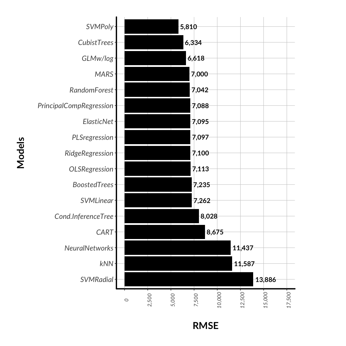
For the data scientists out there, it turned out that a Support Vector Machine model with a Polynomial kernel was the most accurate model - an RMSE of 5,810, meaning that the model predicts attendance plus/minus 5,810 people two thirds of the time. This does not seem particularly accurate but the model does have an R2 of 83%, meaning that the factors that are included in the model seem to explain 83% of the variability in the data.

In my opinion, 83% is a pretty good result and while I wouldn’t use this model for forecasting, it is enough to gain some understanding about what is driving attendance. My guess is that the next big factor that I’m missing here is the weather forecast for the day of the match (as opposed to actual weather). I’d suggest that this would have a significant bearing on attendance.

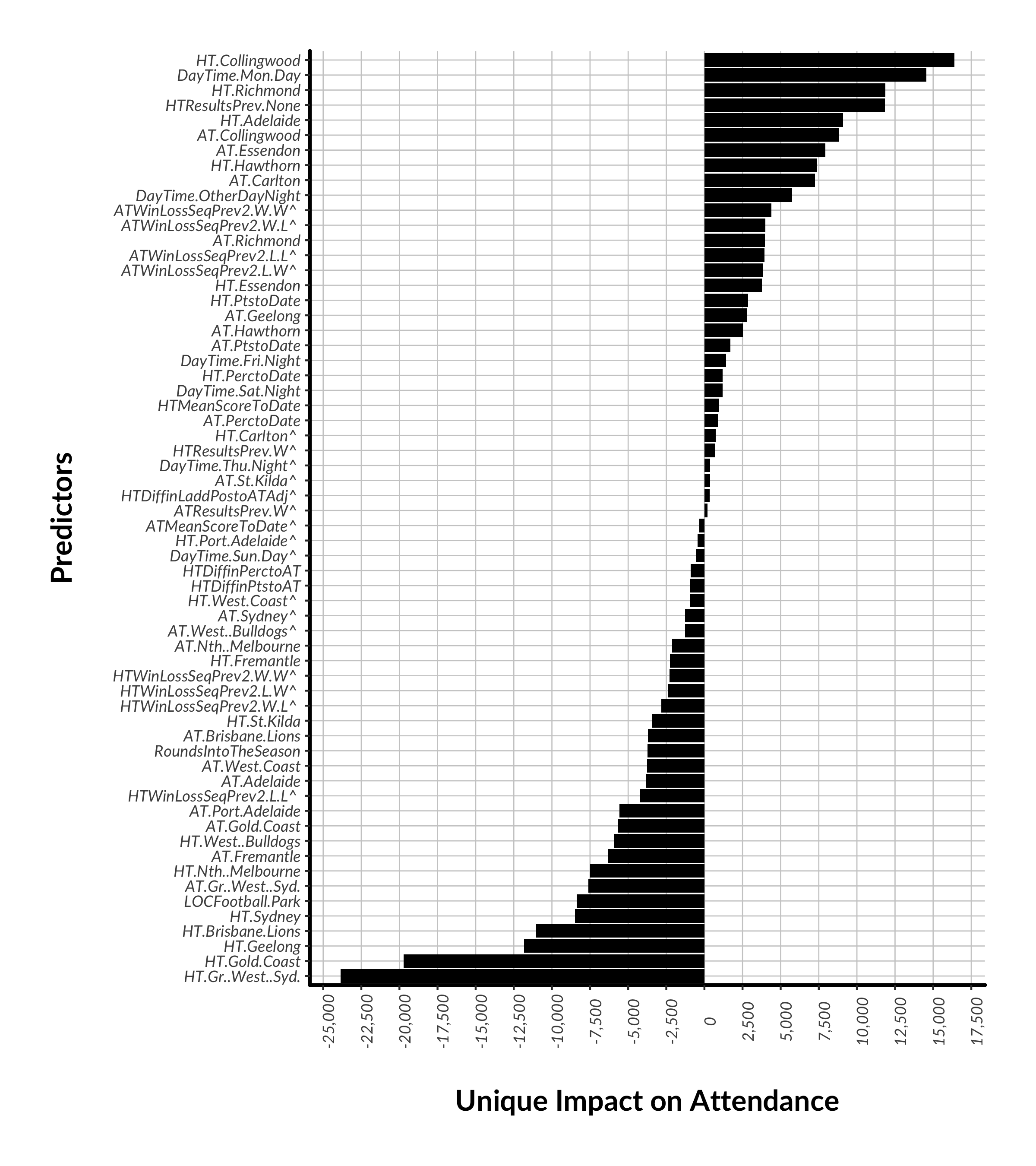
Now, one can’t readily interpret SVM models so I’m going to show you some co-efficients from a General Linear Model with a logarithmic link function. It also performed reasonably well with an RMSE of 6,618 and an R2 of 78%.

In the chart below, we see that who the away team is can play a large role. No surprises there. If your team is playing Collingwood (ATCollingwood), then that adds 8,845 punters on average. Essendon and Carlton add large numbers too.  In contrast, one should expect 7,600 less if the home team is playing Greater Western Sydney (ATGr..West...Syd.). 

The day and time of the match makes a difference, with big impacts from “special” event games (DayTime.Mon.Day, DayTime.OtherDayNight). On the other hand, a team playing disproportionately more Sunday games should be compensated by the AFL, with 570 mowing the lawn instead (relative to a Saturday Day fixture). Melbourne Football Club aka "The Sunday Specialists" has claims. Surprisingly, a Friday night game is only worth an extra 1,400 in attendance. So much for the "big stage". It looks like Friday night crowds are only as good as the teams that are playing. There is nothing intrinsically special about it.

Interestingly, a team's run into the match (what happened in the prior round or prior two rounds) has some bearing on on how many turn up but it does not seem to matter much if the away team has had wins or losses in the prior two matches, albeit that the model does not deem these factors “statistically significant”. We need a few more seasons (and more data) to run in order to develop robust conclusions.

Figure 6: Unique impact of factors on true home ground match attendance from 2006 onwards. The baseline category for DayTime is SatDay and therefore DayTime results can be interpreted in relation to this category. ATMelbourne and HTMelbourne were ch…

Figure 6: Unique impact of factors on true home ground match attendance from 2006 onwards. The baseline category for DayTime is SatDay and therefore DayTime results can be interpreted in relation to this category. ATMelbourne and HTMelbourne were chosen as the baseline category for team-related predictors. HTDiffinLaddPostoATAdj is the difference in ladder position between the home team and the opposition going in to the match, adjusted for the number of teams in the competition in that season. Draws were recoded as losses or "non-wins"). Ladder position was not explicitly included in the model as it was highly correlated with points and percentage.

^indicates a predictor that is not statistically significant - p>0.05

The model also confirms the initial hypothesis that the more wins the home team has (HT.PtstoDate) (shorthand for ladder position), the larger the crowd, even controlling for progress through the season. Each point is worth 3,700, so a win is worth 14,800 more through the gate. Higher points for the away team has a smaller, but significant, impact too (9,200 per win to date). Intuitively, this makes sense, we love to see contests between highly ranked sides.

Note that the difference in ladder position was not a strong predictor (HTDiffinLaddPostoATAdj) but not small either (-1,000 per point). A difference of 1 win is 4,000 less fans which also seems sensible. We like matches between highly ranked, but also closely ranked, teams. However, a match-up between two lowly ranked, but closely matched teams, is relatively less exciting which is why absolute points has a larger effect.

So fans love a contest between two high ranking, closely matched teams (derr, Fred). But these kind of matches are also important when your team is out of the race and you’re looking for something to watch on telly (and this is what the AFL should be aiming for with their scheduling of Friday night games). But how often does this actually occur? Did 2017 actually have more salivating contests than usual? Perhaps this is what made it such a great season. I'll take look a this in the next post: "Part III: Blockbusters & Stinkers".


For the data scientists out there, here’s how different algorithms ranked in terms of RMSE performance. I think a good model might get to an RMSE of 2,500 or better, something you might use to figure out how many pies to pull from the freezer.  I’d hope we could get there  with the addition of a weather factor. Tree-type models didn’t fare well but I think this has a lot to do with the volume of categorical variables in the set of predictors.

Figure 7: Trialled models to predict home ground match attendance from 2006 onwards. 10-fold cross-validation applied.

Figure 7: Trialled models to predict home ground match attendance from 2006 onwards. 10-fold cross-validation applied.

Part III: Blockbusters, Stinkers and Upsets

So in Part I we found that what made 2017 great was the resurgence of Victorian teams. This was evident in increased match attendances. In Part II, we found that attendance is driven by match-ups between teams that are higher up the ladder but also that they have similar numbers of wins to date. Therefore the hypothesis is that 2017 was also great because the competition was more even, and there were more matches between evenly matched teams.

Let's look at the latter first up, match-ups between evenly matched teams. We see below that the mean difference in ladder positions per match has been high in recent times, although not a historical record (the all-time record was set in 1971). From 2013 to 2016 inclusive, the median difference was 12 points (3 wins), which was a record for consecutive seasons. This indicates a period of dull footy, a lack of contests between closely matched teams. The great news is that this came back to a median difference of 8 points in 2017, though the best season in recent times was actually 1997. In that season, even the 15th placed Hawthorn managed 8 wins.

Figure 8: Home team difference in points to away team prior to the match. The first quarter of the season is excluded to allow enough time for the competition to settle.

Figure 8: Home team difference in points to away team prior to the match. The first quarter of the season is excluded to allow enough time for the competition to settle.

To illustrate this increase in competitiveness further, we see below that there were relatively more matches between teams on the same points or 1 or 2 wins difference. And there were no matches between teams that had 32 points/8 wins+ in 2017. In contrast, 2013 was extraordinarily dull when Hawthorn and Geelong dominated, while Melbourne and GWS were uncompetitive.

Figure 9: Recent distribution of difference in points between the home team and away team prior to the match. The first quarter of the season is excluded to allow enough time for the competition to settle.

Figure 9: Recent distribution of difference in points between the home team and away team prior to the match. The first quarter of the season is excluded to allow enough time for the competition to settle.

And it can vary across the season too. 2012, 2013 and 2016 had some truly boring rounds of football. In contrast, 2017 was consistently competitive for longer. Even Round 18 was great with only 1 predictable match,  Essendon (32 pts to date) vs North Melbourne (16 pts), a match that Essendon won by 27 points. 2017 was a tough year for tipping and this is the mark of a great season.

Figure 10: Mean difference in points each round. The first quarter of the season is excluded to allow enough time for the competition to settle.

Figure 10: Mean difference in points each round. The first quarter of the season is excluded to allow enough time for the competition to settle.


Now, I did say that “salivating contests” meant not only closely matched teams but also high ranking (Q clash anyone?). We see below that the rate of games between top 8 teams is reasonably stable across seasons, more an arithmetic reality if anything. If top 8 teams constantly played each other then bottom 8 teams would also playing each other and, by definition, there would inevitably be movement up and down the ladder.

Figure 11: Match-up types by season. The first quarter of the season is excluded to allow enough time for the competition to settle.

Figure 11: Match-up types by season. The first quarter of the season is excluded to allow enough time for the competition to settle.

Putting both of these factors together, points differential and wins to-date, we see that "blockbusters" (two top 8 teams separated by no more than 2.5 wins) aren’t as frequent as we might imagine. 2017 was good but no better than the previous two seasons overall (there were 27 in 2016 as well). However, there were three rounds when there were 3 blockbusters, the last in Round 20 when Geelong hosted Sydney, GWS hosted Melbourne, and Adelaide played Port Adelaide. 

Figure 12: Blockbusters by round by season. The first quarter of the season is excluded to allow enough time for the competition to settle.

Figure 12: Blockbusters by round by season. The first quarter of the season is excluded to allow enough time for the competition to settle.

And as for blockbusters on a Friday night, “the big stage” (not to be confused with the Grand Final which is “the big dance”), the AFL managed to fixture 7 of them, a good number but not as many as 2016, 9. C'mon AFL, you can do better!

Figure 13: Friday night blockbusters by round by season. The first quarter of the season is excluded to allow enough time for the competition to settle.

Figure 13: Friday night blockbusters by round by season. The first quarter of the season is excluded to allow enough time for the competition to settle.

But at least the AFL managed to avoid a Friday night stinker in 2017 (a stinker being when the difference between teams is 4.5 wins or more). The last one was in round 21, 2016 when the Doggies, seventh, hosted Collingwood, twelfth. Only 35,000 turned up at Docklands. 

Figure 14: Friday night stinkers by round by season. The first quarter of the season is excluded to allow enough time for the competition to settle.

Figure 14: Friday night stinkers by round by season. The first quarter of the season is excluded to allow enough time for the competition to settle.

Interestingly, the Dogs only got home by 3 points that game, which goes to show that the difference in wins-to-date isn’t always everything. Even if it’s not a clash of titans, I’m sure that many of us tune in anyway, hoping for a close game, if not an upset. The prospect of an upset is a wonderful element of this game, and sport more generally.  Potentially, this is what also made 2017 a great season, that there were more upsets than before.

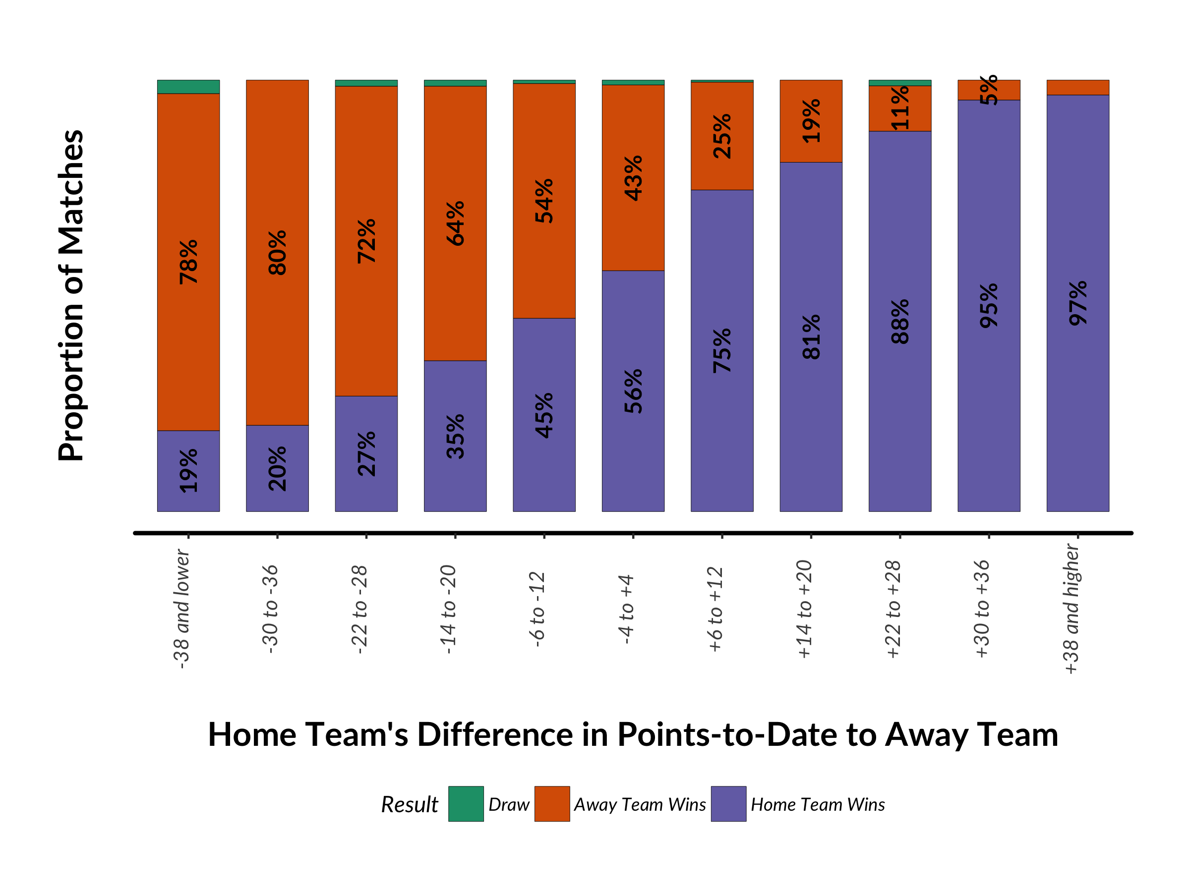
To set the scene, here is the overall likelihood of victory based on wins-to-date alone. We see that the chances of the away team getting up is pretty slim once the difference in ladder points gets above 20. On the other hand, home teams do have a small but reasonable chance of winning even though they are way below the other team in terms of wins-to-date. And fans seem to know this, which is why fans turn up to some extent despite a mismatch. 

Figure 15: Match results  by home team's difference in points-to-date to away team. Filtered to 2006 onwards and the home team's official home ground. The first quarter of the season is also excluded to allow enough time for the competitio…

Figure 15: Match results  by home team's difference in points-to-date to away team. Filtered to 2006 onwards and the home team's official home ground. The first quarter of the season is also excluded to allow enough time for the competition to settle.

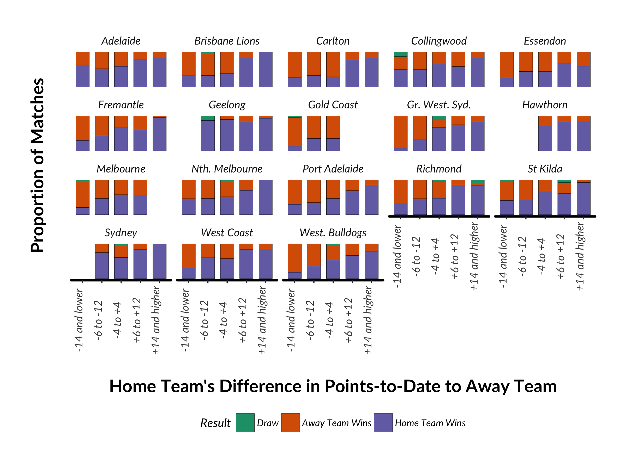
And here we see the result by team and how, regardless of the fewer number of wins, the home team still has a reasonable chance of winning. The largest fortress in terms of influence on results is clearly Kardinia Park. Regardless of whether the opposition is above or below them in terms of wins, the Cats win most of the time. And the fans know this, which is why we saw earlier that they turn up rain, hail or shine. Sydney, Adelaide, and Collingwood also like playing at home. The opposite is true for the Western Bulldogs and Essendon at Docklands. Even if they have more wins under their belt, the opposition still has a reasonable chance of victory.

Figure 16. Match results by home team's difference in points-to-date to away team for each home team. Filtered to 2006 onwards at a home team's official home ground. At least 5 matches need to have been played in each category. The first q…

Figure 16. Match results by home team's difference in points-to-date to away team for each home team. Filtered to 2006 onwards at a home team's official home ground. At least 5 matches need to have been played in each category. The first quarter of the season is also excluded to allow enough time for the competition to settle.

But what is of most interest is how the chance of winning based on ladder points differential has changed over time. We'd like to see that upsets were more becoming more likely.  

The reality is that the chances of an upset are fairly steady in recent times. The chances of a home team upset (the dark red line) is steady. And the certainty of victory for a stronger home team (the dark green line) also seems to bounce around in recent times without a clear trend either way. However, it was only 79% in 2017 and hopefully go even lower in 2018. Fans of weaker teams can build their confidence of a win and subsequently turn up. And non-partisan fans have even more reason to watch the 27 hours of footy on television over a weekend.

Figure 17: Incidence of the home team winning by the home team's difference in points-to-date to the away team. The first quarter of the season is excluded to allow enough time for the competition to settle.

Figure 17: Incidence of the home team winning by the home team's difference in points-to-date to the away team. The first quarter of the season is excluded to allow enough time for the competition to settle.

In this section, we looked at types of match-ups and the likelihood of the underdogs getting up. In 2017, it was very much about better match-ups than in the past, rather than more upsets. In Part IV, I'll look at a further idea, that 2017 was great because even though higher ranked teams have prevailed (as they have always done), at least it might have been a close contest.

Part IV: "We've Got the Close One!"

So 2017 was great because Victorian fans had more to cheer about and because there were better match-ups each week. We've ruled out an increase in upsets. If your team is a massive underdog, and your team playing at home isn't Geelong, then odds are that they won't win. But what about the close-ones, when the underdogs gave the favourites a scare? Did 2017 have more of these type of games?

If we have a look at the distribution of winning margins since the VFL/AFL began (moving from dark red in 1897 to dark blue in 2017), we see that winning margins have tended to increase over time, with more recent seasons having higher margins. The abnormal seasons are 1922 which had 30 out of 72 games decided by 2 or 3 goals. And in 1907, 31 out of 68 matches were decided by 2 or 3 goals. Now that’s competitive!

Figure 18: Distribution of winning margins by season. 1897 is the dark red end of the spectrum through to yellow. green, then dark blue in 2017

Figure 18: Distribution of winning margins by season. 1897 is the dark red end of the spectrum through to yellow. green, then dark blue in 2017

If we summarise the data, the trends in mean and median margins echo the above. We see that the mean margin really picked up after 1976. It does beg the question of what caused this. We do know that the 70s were when teams (or some groups of players at least) were starting to be paid as professionals. 1975 was also when regular season matches were broadcast on television in colour. My guess is that this brought larger audiences, more advertisers dollars to broadcasters, more value for broadcasting rights, and finally more funds for clubs to invest in training facilities. And with some clubs adapting to this new professionalism better than others, a new gap in on-field fitness developed ensuring that some teams could maintain a run-on in a match for longer. Ground maintenance also may have improved in the late 70s so that higher scores could be kicked. 

For this discussion however, what's more important is that the mean and median margins came down in 2017, having reached an all time peak in 2012 (mean of 42, median of 42). 2017's mean margin of 31 was a level not seen since 1998. The median margin of 25.5 was a level not seen since 2007. There had been a fairly long period of dull matches between 2011 and 2016 inclusive.

Figure 19: Mean and median winning margins by season.

Figure 19: Mean and median winning margins by season.

Let's dissect this trend a little more. If we look at the spread of margins over time below, there are even small jumps in the 20th percentile after 1980, which rose to 14 points. 1 in 5 matches have been decided by more than 2 goals for quite some time. But by far the largest increase is at the higher end with a huge leap in the number of blowouts from the mid-70s onwards, then coming back down in the mid-noughties (arguably due the more defensive style of play pioneered by Paul Roos' "winning ugly" Swans). But large margins started to re-appear from 2006 onwards. By 2016, 20% of matches (the 80th percentile) were decided by almost 11 goals. Boring. Thankfully, this came back a little to 52 points in 2017. Perhaps we noticed this in 2017, that more matches were more competitive than in the recent past. And while no-one wants "winning ugly" to come back into fashion, let’s hope this is the start of a downward trend in blowouts.

Figure 20: Winning margin percentiles by season.

Figure 20: Winning margin percentiles by season.

One obvious hypothesis for this period of high winning margins (2011-2016) was the entrance of Gold Coast in 2011, followed by Greater Western Sydney (GWS) in 2012, that perhaps these teams were being belted week after week. Below shows the proportion of losses for the two largest losers in the competition each season. In 2012, it certainly was Gold Coast and GWS representing 31% of all losses but other teams featured from 2013 onwards. That recent spike in 2013 was when GWS (20%) and Melbourne (17%) represented 37% of total losses (and had 3 wins between them). In 2014, it was St. Kilda and Brisbane (18% and 14% respectively). In 2015, it was Carlton and Brisbane (both 13%). And in 2016, it was Brisbane and Essendon (18% and 15% respectively).

Figure 21: Share of losses among the two biggest losers each season. Filtered to 1925 onwards when the VFL became a 12 team competition.

Figure 21: Share of losses among the two biggest losers each season. Filtered to 1925 onwards when the VFL became a 12 team competition.

So they did get belted initially but mostly what seemed to happened is that by soaking up draft talent from the 2010 draft onwards (and Essendon falling foul of the law), other teams were also being belted week after week. And it’s ironic that as part of pushing the game in Queensland by adding Gold Coast, the AFL have inadvertently kept Brisbane near the bottom.

Looking at it from the other angle, the period between 2011 and 2016 was also distinctive in that the top 4 teams were very dominant. The worst season was 2011 when the top 4 only accounted for 4% of the season's losing margins. Geelong, Hawthorn, Collingwood and West Coast only lost 14 games between them, a record low. For supporters of other teams, it does not get more boring than 2011. Luckily, things got back too normal in 2017. The top 4 lost 27 times in 2017, a level not seen since 2009. This reinforces the earlier finding that not only week-to-week match-ups were more even in 2017 but the top teams lost more frequently. The AFL's socialist paradise re-emerged in 2017 and this was another reason why we thought footy was so great. May they never add two teams built from scratch in non-AFL states again.

Figure 22: Share of losses among the four smallest losers each season. Filtered to 1925 onwards when the VFL became a 12 team competition.

Figure 22: Share of losses among the four smallest losers each season. Filtered to 1925 onwards when the VFL became a 12 team competition.


So with margins coming back to some level of normality and the top teams also copping their fair share of losses, I want to look at one last angle to assess the quality of the competition - the comeback. Even if it’s not an upset (which we saw earlier are not any more common than they've ever been), or even a close margin in the end, at least it might have been close at three-quarter time. Even better, when might have seen more team's bouncing back in the last quarter to retake the lead and seal a victory (personally these are my favourite games to watch, when the Dees are down but storm home). 

Let’s first look at how a team’s chances of winning have varied based on the situation they find themselves at each quarter-time break. Below is the trend of the home team’s rate of winning if they are behind at the breaks. We see that if the home team has been behind at each quarter, then their chance of winning is around 10%, and this has been the level for around 30 years. If the home team was up in the 1st qtr, then the chances of winning are slightly higher, and if the team is only down at the 3rd (after being up in the 1st and 2nd), then it is now almost a 50/50 shot at winning. Put another way, home ground advantage is worth a little more of late.

Figure 23: Incidence of the home team winning for different quarter-time scenarios by season.

Figure 23: Incidence of the home team winning for different quarter-time scenarios by season.

If we look from the opposite angle, home teams being up at the breaks and then losing, we reach a similar conclusion. Away teams have little chance of winning (just under 10%) if they’ve been down at each break, Even if they are up at three-quarter time (but the home team have been up at the 1st and 2nd change), the away team’s chances are just as slim. There is a “wet-sail” factor evident as well. Even if the away team was up at the first two breaks but conceded the lead at the final break, they have little chance of recovery. The home team will go on to win around 80% of the time. This has been the case since the 90s and is not unexpected given the expansion of the competition outside of Victoria and home ground advantages intensifying. 

Figure 24: Incidence of the home team losing for different quarter-time scenarios by season.

Figure 24: Incidence of the home team losing for different quarter-time scenarios by season.

So, it’s one thing to look at the likelihood of winning and losing but let’s see if these "foregone conclusion" scenarios are more prevalent than before. The good news is that matches where the home team leads, or scores are even, at every change is relatively flat, a touch under 40% of all matches (recall that the home team goes onto win over 90% of the time). The bad news is that matches where the home team is losing at each change has risen to a high level to represent around 30% of matches (and the home team has a 10% chance of winning these). And 2017 was no different.

Other variations are no more common than they've ever been. Where we saw earlier that home teams had an increasing advantage in this HT- > HT- > HT+ scenario, those matches are still relatively uncommon (5% of matches).

Figure 25: Incidence of match scenarios each season. 

Figure 25: Incidence of match scenarios each season. 

Putting it together. If we take the HT- > HT- > HT- > HT win and the  HT+ > HT+ > HT+ > AT win scenarios as the definition of a comeback then we see below that 2017 was a good year, the best since 2005. In 2017, they were 9% of all matches. The best home team comeback of 2017 was Geelong playing North at Docklands and North were up at every change, 25 points going into the final quarter, and managed to lose by a point. There were 8 comebacks by away teams in 2017. The best was arguably Sydney coming back from a 29 point deficit at quarter-time against Richmond at the MCG in Round 13, clawing that back to a 13 point deficit at three-quarter time and going on to win by 9 points. Good times for Swans fans.

Figure 26: Comebacks by season. A comeback is defined as either of these scenarios:  HT- > HT- > HT- > HT win and the  HT+ > HT+ > HT+ > AT win.

Figure 26: Comebacks by season. A comeback is defined as either of these scenarios:  HT- > HT- > HT- > HT win and the  HT+ > HT+ > HT+ > AT win.

Now, the definition of a comeback need not be purely defined by the margin at every change, but also the margin at three-quarter time, regardless of who was leading at previous changes. Below we can see a home team’s chances of winning based on this margin. Chances of winning sharply diminish if the home team is down by 3 or more goals or the away team are down by 2 or more goals.

Figure 27: Match result by home team's three-quarter time margin. All seasons since 1897.

Figure 27: Match result by home team's three-quarter time margin. All seasons since 1897.

And the chances of the home team coming back hit a recent high in 2017, home teams winning 11% of the time, even though they are down by 3 goals or more at three-quarter time. This is similar to what we saw earlier with home ground advantage becoming more important. Away team's chances remain slim.

Figure 28: Chance of a three-quarter time comeback for different scenarios by season. 

Figure 28: Chance of a three-quarter time comeback for different scenarios by season. 

So let's add these to our tally of comebacks and we see below that comebacks represented over 10% of all matches in 2017, the best result since 1995. The best home team comeback was the aforementioned match where Geelong came back against North. Freo also managed to do it twice, once against North, coming back from 24 points down at Subiaco, and also coming back from 23 points down against the Bulldogs. There were 3 away team comebacks as well, the best being Brisbane at the Docklands vs Essendon in round 15. Essendon somehow managed to blow a 19 point lead at three-quarter time.

Figure 29: Comebacks by Season. A comeback is defined as either of these scenarios:  HT- > HT- > HT- > HT win,  HT+ > HT+ > HT+ > AT win, HT down by 3 goals or more at three-quarter-time and winning, or AT down by 2 …

Figure 29: Comebacks by Season. A comeback is defined as either of these scenarios:  HT- > HT- > HT- > HT win,  HT+ > HT+ > HT+ > AT win, HT down by 3 goals or more at three-quarter-time and winning, or AT down by 2 goals or more at three-quarter time and winning.

So there you have it. In terms of the quality of the competition, footy did indeed suck between 2011 and 2016 (unless you followed the premiership team of course) but 2017 was a remarkable year on many fronts. Finally, the distortions created by adding Gold Coast and GWS to the competition seem to be behind us (including, for me, the "lost decade" for Melbourne Football Club). Brisbane Lions may yet start to show something too. Here's to a fine 2018. Footy!